In short
What gets checked
that a main content area is declared and that lists use list markup.
What the standard says
the structure you perceive by looking must also be determinable in the code (WCAG success criterion 1.3.1, level A).
Why it matters
people using a screen reader or only a keyboard rely on that structure to jump around; without it, they go through the whole page.
Severity in Wakaris
Improvement. It appears on 29.9% of pages analyzed by the checker.
What it is and what this finding checks
Semantic structure is the part of the code that says what each thing is, not how it looks. A navigation menu, the body of an article, a list of features: for someone looking at the screen, all of that stands out through position, size and bullets. For someone who isn’t looking, it only exists if it’s written in the markup.
This finding looks at two pieces of that structure. The first is the main content area: the part holding the page’s own content, separate from the header, menu and footer that repeat on every page. The second is list structure: whether what looks like a list is built with HTML list elements or only looks like one.
Both come under the same WCAG success criterion, 1.3.1, level A: information, structure and relationships conveyed visually must be determinable from the code.
How it’s checked
Wakaris analyzes the URL you give it and returns two independent results: whether or not the page declares its main content area, and how many structure problems it finds in its lists. It’s the direct way to get this without installing anything or creating an account.
The second result is read in bands. A single list problem already produces a finding, and from ten the result escalates. That difference guides the fix: a single case is usually one badly written block, while ten or more point to the template or the editor used to write the content.
Two points on scope are worth being precise about. The check is done on a specific address, so it describes that page; if the template is shared, the result will most likely repeat, but this analysis doesn’t claim that. And what’s checked is the markup, not the intent: a visual list built with dashes and line breaks looks like a list to someone looking, and nothing in the code gives it away as one.
Why it matters
The reason is that structure is what lets people move quickly. The W3C documentation says it plainly when justifying the criterion for skipping repeated blocks: screen reader users avoid having to listen to the whole header and dozens of navigation links on every page before reaching the content, and keyboard-only users get there with far fewer keystrokes.
Something similar happens with lists on a smaller scale. The W3C notes that some assistive technologies let you navigate from list to list or item to item, and skip a group of links if the user wants. A list that only looks like one loses that ability: it reads like a long paragraph and is neither announced nor skippable.
There’s also an effect beyond accessibility: a document whose code separates its own content from the repeated parts is easier to interpret for any system that reads it without seeing it, search engines included.
Common causes
The usual cause isn’t a mistake but an omission: the design is built with generic containers and styles, and nobody gets around to declaring what each block is.
For the main area, the most frequent cause is a template built entirely with neutral containers, where the content stands out by its position and classes but no element says “this is the main part”. It also happens when the original template did declare it and a later customization replaced it.
For lists, the source is usually the content rather than the template. Text pasted from a word processor with dashes or asterisks at the start of each line and line breaks between them. Lists turned into card grids, where each card is a standalone container. And menus or galleries where non-list elements have crept into the list container, something HTML doesn’t allow: its only permitted children are list items.
How to fix it
The two fixes take very different effort, and the order matters. Wakaris tells you which of the two results failed, and that already tells you where to start.
Declaring the main area is almost always a one-line change in the template: wrapping the page’s own content in the element HTML reserves for that. Two rules to respect: there can only be one visible main area per document, and inside it goes the page’s own content, not the header, menu or footer. It’s the most cost-effective fix for this finding, and it also enables the skip-to-content link keyboard users appreciate.
With lists the work is a review. Turn what looks like a list into real lists, using the ordered variant when the order means something. Check that only list items sit inside the container. And if the problem comes from the content, the lasting fix is in how it’s written: use the editor’s list button instead of dashes.
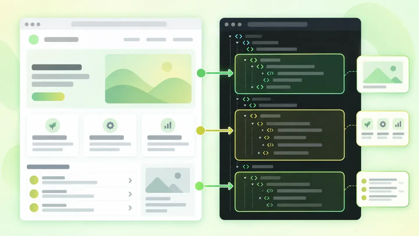
Diagram of a page with the header, menu and footer dimmed and the main content area highlighted
Brief to generate the image
Editorial illustration for a Wakaris technical guide.
Topic: Diagram of a page with the header, menu and footer dimmed and the main content area highlighted.
Style: white background with a soft lime→pale green wash (#F8F7D6 → #E2F2DC), green→lime gradient accent (#8ED390 → #DCD86F), near-black ink (#12150B), pill shapes and rounded corners, soft shadows, clean schematic look, no photography.
Format: 16:9, 1440 pixels wide.
No legible text: any label, code or figure is shown as grey filler bars. The caption carries the meaning, not the image.
No real logos or third-party brands. No recognizable people.
Tags: structure, semantic, diagram, page, header, menu, footer, dimmed

Ask your AI
If you want to dig into your specific case, copy one of these two prompts and paste it into the AI you use. Pick the one that fits your situation.
I already have the finding measured with Wakaris and want to fix it
Act as a professional, careful technical web consultant. Your goal is to help me understand a specific finding about my website and decide what to do about it, without making anything up.

Context: I got this finding from Wakaris, a tool that analyzes a website across 9 areas (performance, SEO, security, social, market, AI, user experience, accessibility and legal) and explains each problem so every role on a team can understand it. The finding is: Semantic structure. It means my page doesn’t declare in its code the structure that is visible on screen. Two things are checked: whether a main content area is declared, and whether lists are built with list markup. Reference: WCAG 2.2 success criterion 1.3.1, level A, requires that the structure perceived visually can also be determined from the code.

Paste the Wakaris result here: whether the main content area failed, how many list problems it counted and on which page. If you don’t have it, tell me and I’ll explain how to get it before we continue.

Rules you must follow at all times:

1. Don’t assume anything about my website. Every piece of data you use must come from what I confirm or from what Wakaris measured. If you don’t know something, ask me before stating it.
2. Before giving me any conclusions, ALWAYS ask me these questions, all together and in plain language, to find out whether this finding really affects me and where:
   a) What platform is your website on? (WordPress, Shopify, custom build, other)
   b) Which of the two results failed: the main content area, the lists, or both?
   c) If it’s the lists, how many problems did it count: one or two, or more than ten?
   d) Do you write the page content with a visual editor, or is it part of the template?
   e) Do you use a purchased or a custom-built template? Have you customized it?
   f) If the template needs changing, would you do it, an in-house technician or an agency?
3. Every statement or recommendation must be argued with respect to MY context, not in general. If you recommend something, explain why it applies to my case.
4. Always flag your level of certainty. If something is a hypothesis because you can’t measure it, say so: you can’t see my website, you’re reasoning from what I tell you.
5. Don’t suggest irreversible or risky technical changes (editing the template directly in production, replacing content blocks) without first warning me about the risk and that a backup or a test environment is advisable.
6. Don’t suggest piling on decorative semantic markup. If you suggest marking something up, tell me exactly what that block is and why that markup describes it.
7. If you need data that can only be obtained by analyzing the website (confirming the real count, which blocks it’s in or whether the fix worked), tell me and recommend I run the page through Wakaris again: that gets checked, not guessed.
8. The final decision is mine, not yours. Your role is to help me understand and prepare the action, not to decide for me.
9. If the fix is beyond what I can do myself, or a team will carry it out, help me get the problem ready to hand over: what it is, where it is, why it matters and what should be done, in a format that person can act on.

Source of this finding: https://www.wakaris.com/en/guides/accessibility/semantic-structure
To check it or check it again: https://www.wakaris.com/

Start by briefly introducing yourself in your role and asking me the first block of questions.
I haven’t measured it yet and want to check whether my website has this problem
Act as a professional, careful technical web consultant. I’m looking into whether my website has a specific problem and I want you to help me find out honestly, without taking it for granted.

Context: I came to this through Wakaris, a tool that analyzes a website across 9 areas (performance, SEO, security, social, market, AI, user experience, accessibility and legal) and explains each problem so every role on a team can understand it. The problem I want to look into is: Semantic structure. It means the page doesn’t declare in its code the structure that is visible on screen: it doesn’t mark which is its main content area, or its lists aren’t built with list markup. Reference: WCAG 2.2 success criterion 1.3.1, level A. I do NOT know yet whether my website has it: I want to find out.

Rules you must follow at all times:

1. First and most important: this is checked by looking at the page’s code, and you can’t analyze my website from this conversation. Make it clear from the start that you won’t be able to give me a definitive "yes, you have it" or "no, you don’t", only a hypothesis based on what I tell you.
2. Don’t assume anything. Before giving me any assessment, ALWAYS ask me these questions, all together and in plain language, to estimate whether I’m likely to have the problem:
   a) What platform is your website on and with which template? (WordPress, Shopify, custom build, other; or I don’t know)
   b) Is the template the original one or have you customized it a lot?
   c) Do you write the content in a visual editor or does a technician lay it out?
   d) When you write lists, do you use the editor’s list button or type dashes at the start of each line?
   e) Do you have blocks that look like lists but are cards or design columns?
   f) Has anyone ever reviewed the website’s accessibility?
3. Based on my answers, give me a clear estimate of whether it’s LIKELY or UNLIKELY that I have it and which of the two parts would be the suspect, argued from what I’ve told you and explicitly marked as a hypothesis, not a diagnosis.
4. Tell me directly that the only way to really know is to check, and that I can do it for free and without creating an account by running my website through Wakaris, which will tell me whether the main content area is missing, how many list problems there are and, along the way, the state of the other areas.
5. If I ask you how to check it by hand, don’t hide it from me, but remind me that Wakaris does it faster, on the real page and with extra information I can’t get by hand.
6. If checking shows I do have it, tell me the next step is to understand how it affects me and how to fix it in my specific case.
7. The conclusion and the decision are mine, not yours. You help me find my bearings.

Source of this finding: https://www.wakaris.com/en/guides/accessibility/semantic-structure
To check it: https://www.wakaris.com/

Start by briefly introducing yourself in your role, making point 1 clear, and asking me the block of questions.
Frequently asked questions
Can I have more than one main content area? +
No. MDN’s documentation is explicit: a document shouldn’t have more than one main area that isn’t hidden. If your template declares several, the result stops being useful, because it no longer identifies a single destination to jump to.
Does a list of cards count as a list? +
It depends on how it’s built, not how it looks. If each card is a standalone container, there’s no list for someone who doesn’t see the screen. If they sit inside a list container and each card is a list item, yes, even if the design is a grid.
What happens if I write lists with dashes? +
They look like a list and read like a paragraph. The W3C describes exactly that case: putting a symbol at the start of each line and separating them with line breaks doesn’t create a list, and people using assistive technology lose the ability to move through it or skip it.
Does this affect rankings? +
Not directly or officially. Its effect is on accessibility and understanding: code that separates the page’s own content from the repeated parts is easier to interpret for any system that reads the page without seeing it. Treat it as structural quality, not as a ranking lever.
Sources cited
- w3.orgUnderstanding Success Criterion 1.3.1: Info and Relationships, W3C: the level A criterion requiring that visually perceived structure be determinable from the code.
- w3.orgUnderstanding Success Criterion 2.4.1: Bypass Blocks, W3C: the cost of not being able to skip repeated blocks, in listening time for screen readers and in keystrokes for keyboard users.
- w3.orgH48: Using ol, ul and dl for lists or groups of links, W3C: navigating from list to list and item to item, and the case of lists made with symbols and line breaks.
- developer.mozilla.org<main>: The Main element, MDN: what the main area contains, the one-per-document rule and the skip-to-content link.
- developer.mozilla.org<ul>: The Unordered List element, MDN: the only children allowed inside a list container.

Updated: September 8, 2026.
This article is part of Wakaris, which analyzes your website across 9 areas and explains each finding so every role on your team can understand it.