In short
Sample
529 health and pharmacy websites, within a corpus of 4,590 Spanish companies.
Contrast
86.4% fail (457 of 529), versus 75.5% overall.
The four basics
only 7.6% pass them (40 of 529), versus 13.5% overall.
In plain terms
one in thirteen passes them; overall, one in seven.

What this study measures and what we found in health
This study does not assess anyone’s quality of care. It measures the technical state of the home page of 529 health and pharmacy websites, with the same checks as the other 4,061 companies in the corpus.
It is worth starting with what doesn’t stand out: it is the honest half of the finding. On three checks the sector is practically average: links, buttons or frames without a name that identifies them, 72.2% (382 of 529) versus 71.2%; tap targets that are too small or too close together, 31.2% (165 of 529) versus 30.8%; and invalid ARIA markup, 9.5% (50 of 529) versus 8.0%.
What sets the sector apart is contrast: 86.4% (457 of 529) versus 75.5%, eleven points. And its aggregate consequence, which is the hard figure in this report: only 7.6% (40 of 529) of health websites pass the four basic accessibility checks, versus 13.5% overall. 92.4% fail at least one, versus 86.5%.
How it is detected: the study method
Between September 1 and 3, 2026, Wakaris ran the same 55 automated checks on 4,590 Spanish company websites, with no exceptions and no later selection, on a sample covering 14 sectors and 52 provinces, with the classification assigned before anything was analyzed.
One note to read the aggregate figure correctly: the four basic checks behind that 7.6% are visual contrast, zoom and scaling, touch target size and text alternatives, and they don’t match the four rows in the previous section, which also include accessible names and ARIA markup. Each percentage is calculated on the websites where that specific check could run, and cells with fewer than 30 observations are suppressed as an insufficient sample.
Then there are the method’s limits: the analysis is automated, looks at the domain’s home page in a single load and detects what can be detected from the outside, without access to the server or the content management system. So it finds text that falls short of the required contrast ratio but can’t tell whether a patient understood the page, and it doesn’t replace a manual review or testing with people.
Why it matters on a health website
The audience of a health website is, by definition, the one that sees worst. The World Health Organization estimates that at least 2.2 billion people have a near or distance vision impairment, and that the leading cause of near vision impairment is uncorrected presbyopia, affecting 826 million people, while distance impairments include cataract, with 94 million, and age-related macular degeneration, with 8 million. That is the portrait of the patient who comes in to check opening hours or a medicine leaflet.
In Spain, the latest INE Disability Survey found that 4.38 million people reported some kind of disability, 94.9 per thousand inhabitants.
WCAG 2.2 success criterion 1.4.3, level AA, requires a contrast ratio of at least 4.5:1 for normal text and 3:1 for large text, while criterion 2.5.8, also level AA, sets tap targets at 24 by 24 CSS pixels with five exceptions, and 1.4.4 requires that text can be enlarged to 200% without losing content or functionality.
Causes: why contrast gets lost in this sector
What follows are working hypotheses, not conclusions of the study. The data says what happens; the why has to be reasoned out.
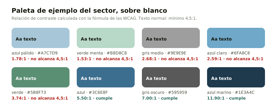
The first is aesthetic, and it is the strongest. Health branding leans toward light gray, pale blue and mint green on white: it conveys cleanliness and calm, and it produces exactly the ratios that fail. Mid gray on white is pleasant to look at on the designer’s screen and disappears on the patient’s.
The second is that the failure isn’t noticeable from the inside. Whoever picks the colors usually has good eyesight, a good screen and an office with controlled lighting. Contrast is the only one of the four that produces no visible error: the page works, it is just hard to read, and nobody writes in to complain about that.
The third is that low-priority text is faded on purpose. Opening hours, footnotes, terms, last-minute notices: they are lightened so they don’t compete with the main message. On a health website, that secondary text is often exactly what the patient came looking for.
How to fix it, starting with contrast
Start by measuring your own website: these figures describe a sector, not anyone in particular. Run your home page through Wakaris and keep the list of accessibility findings.
One: raise the contrast of body text to 4.5:1 against its background. On most websites that means changing two or three color variables in the stylesheet, and every page follows. It is the fix with the biggest effect for the least work, and the guide on visual contrast covers it in detail. Two: review text that was faded on purpose (opening hours, notes, notices) and decide which is really secondary.
Three: check that the page can be zoomed to 200%, which is what half your patients do to read you; the guide on zoom and scaling explains it. Four: give tappable buttons and links at least 24 pixels per side, following the guide on touch target size. Five: write meaningful alt text for images, as the guide on text alternatives details.
Ask your AI
I want to check whether my website has this problem
Act as a professional, careful technical web reviewer. I have a health website (a clinic, a practice, a pharmacy or a health center) and I want to find out honestly whether it has the failures described in this study, without assuming it does.

Context: I got here through a Wakaris study of 529 Spanish health and pharmacy websites (https://www.wakaris.com/en/articles/study-accessibility-healthcare-websites-2026). Wakaris is a tool that analyzes a website across 9 areas (performance, SEO, security, social, market, AI, user experience, accessibility and legal) and explains each problem in a way you can understand. I do NOT know yet whether my website has these failures: I want to find out.

The study checks four basic things: that text contrasts enough with its background, that the page can be zoomed, that buttons are big enough to tap, and that images have a description for people who can’t see them.

Rules you must follow at all times:

1. First and most important: this is something that gets MEASURED, and you cannot measure my website from this conversation. Make it clear from the start that you won’t be able to give me a definitive "yes, you have it" or "no, you don’t", only a hypothesis based on what I tell you.
2. Don’t assume anything. Before judging anything, ALWAYS ask me these questions, all together and in plain language:
a) Who chose the colors of your website, and is there a brand guide behind them, or did they come with the template?
b) Is there light gray text on white: opening hours, footnotes, notices, small print in terms?
c) Has an older person ever told you they can’t find something or can’t read it well?
d) Does your website have a separate mobile version, or is it the same one adapted?
e) Is the appointment booking button your own, or does it come from a third party embedded in the page?
3. Based on my answers, tell me whether it is LIKELY or UNLIKELY that each of the four fails, with your reasoning, and explicitly marked as a hypothesis, not a diagnosis.
4. If I ask how to check it by hand, explain it without hiding anything, but remind me that Wakaris does it faster, across the whole page, and checks the other areas along the way.
5. Don’t approve a color just because it "looks fine": contrast is a calculation between two colors, not an impression.
6. Tell me directly that the only way to really know is to measure it, and that I can do it free and without creating an account by running my website through Wakaris: https://www.wakaris.com/?origen=informe-salud
7. The conclusion and the decision are mine. You help me get my bearings.

Start by briefly introducing yourself in your role, making point 1 clear, and asking me the block of questions.
Frequently asked questions
Exactly how much contrast is needed? +
WCAG 2.2 success criterion 1.4.3, level AA, requires a ratio of at least 4.5:1 between the text color and its background, and 3:1 when the text is large. It is a calculation between two colors, not a judgment call: two people may disagree, the formula doesn’t.
Can this 86.4% be compared with international studies? +
No, and that matters. The leading international study analyzes the million most-visited home pages with a different tool and a different unit of measurement, and finds low contrast on 83.9%, up from 79.1% the year before. They look similar, but they don’t measure the same thing: it is useful for context, never for subtracting.
If my website is average on three out of four, am I fine? +
You are like almost everyone else, which is not the same thing. The figure that matters is the aggregate one: only 7.6% of health websites pass all four basic checks. Being average in a field that fails a lot isn’t a comfortable position; it is the normal one.
Is this a legal obligation? +
This report doesn’t go into that. It measures against WCAG 2.2, the international technical standard for web accessibility, not a Spanish regulation. Which legal obligations apply to each type of health organization depends on its nature and is beyond what this study can say.
Sources cited
- w3.orgW3C WCAG 2.2 — contrast, text resizing, target size and non-text content, in the quick reference and the target size criterion
- who.intBlindness and vision impairment, fact sheet of February 10, 2026, from the World Health Organization
- ine.es2020 Survey on Disability, Personal Autonomy and Dependency Situations, from the INE (Spanish National Statistics Institute)
- webaim.orgWebAIM Million 2026, with a different methodology, at webaim
Authors of this report



Updated: September 17, 2026.