In short
What’s measured
the contrast ratio between the text color and its background color, element by element.
Good values
4.5:1 or more for normal text; 3:1 or more for large text (18 points, or 14 points bold).
Why it matters
according to WCAG, 4.5:1 is calculated so that a person with 20/40 visual acuity can read.
Severity in Wakaris
Critical. It fails on 76.6% of the pages analyzed.
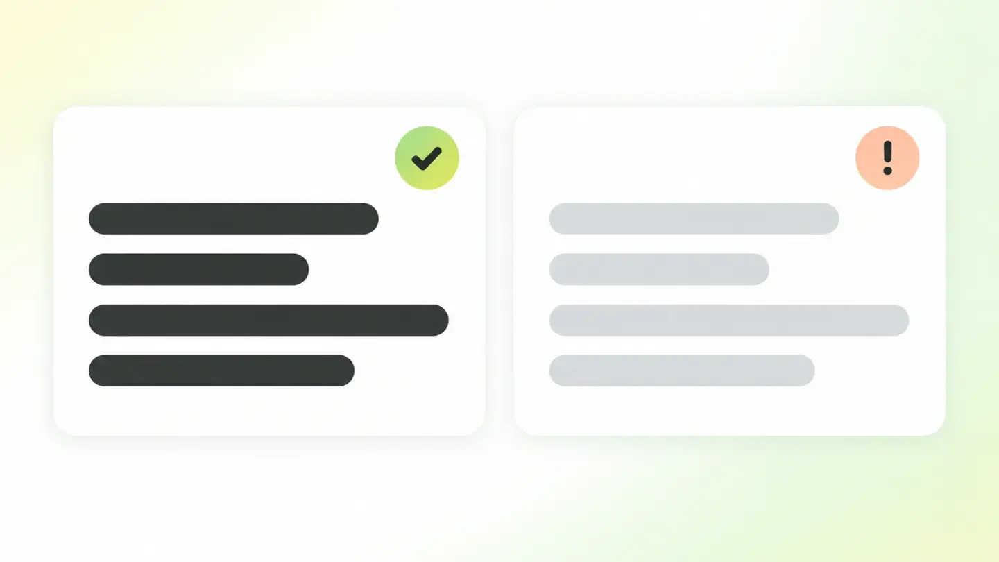
What this finding is and what it measures
This finding appears when some text on your page doesn’t have enough contrast with the background it’s shown on. Contrast here isn’t an impression but a number, calculated by comparing the relative luminance of the text and the background with a fixed formula defined by WCAG. The result is a ratio ranging from 1:1, when both colors are identical, to 21:1, which is pure black on pure white.
WCAG sets two bars in its criterion 1.4.3, level AA. Normal text needs at least 4.5:1. Large text, defined as 18 points or 14 points bold, needs at least 3:1, because large letters are easier to read with less color difference. A light gray on white, so common in secondary text, often doesn’t reach 4.5:1 and fails as normal text.
The standard doesn’t require contrast for logo text, purely decorative text or text in a disabled control; everything else counts, including small footer text and links.
How it’s measured
Wakaris loads the URL you give it, takes the final color of each text and the color behind it, calculates the ratio and compares the result with the bar for that font size. It returns the list of elements that fall short, with their code snippet, and the finding appears from the first failing element, with extra cut-offs at 10 and 30 elements that give an idea of the scale.
The measurement uses the WCAG formula: the relative luminance of the lighter color plus 0.05 is divided by that of the darker color plus 0.05. The resulting ratios are the same ones you’ll see in any accessibility documentation.
An honest limitation: when text sits on an image or a gradient, the background isn’t a single color and an automated check can’t give you a reliable ratio, so Wakaris flags the element for you to review by hand. The measurement looks at the page as it loads; if a dark theme changes the colors, it’s worth analyzing that variant too.
Why it matters
Low contrast isn’t a matter of style but of who can read your website. WCAG explains that 4.5:1 is calculated to compensate for the loss of contrast experienced by a person with moderately low visual acuity, around 20/40. The AAA bar, 7:1, covers 20/80 vision.
MDN’s documentation adds another group: people with some form of color blindness perceive light and dark areas less well and find it hard to make out edges and details. And a phone in full sunlight or a screen with low brightness reduces real contrast for anyone, with no visual condition at all.
For the business, the consequence is direct: text that can’t be read is a button that doesn’t get tapped, a price that isn’t seen and a form that gets abandoned. In addition, in many countries web accessibility is a legal obligation with WCAG AA as the usual reference, and contrast is one of the first criteria checked.
Common causes
The most common cause is a gray that’s too light for secondary text: dates, captions, form hints, placeholder text. It gets chosen because it looks light and nobody measures the ratio; a gray like #999999 on white only reaches 2.85:1 and fails at any size.
The second is the brand color used as a text color. Many oranges, light greens and sky blues work well in a logo, which is exempt, but don’t reach 4.5:1 when used for links or small headings on a white background, and the same goes for white text on a light-colored button.
The third is text on images or gradients without a darkening layer behind it: readability depends on whichever part of the photo is behind each area. The fourth is states: a visited link, a hovered element or an error message in a soft red that nobody checked. The fifth is inheriting a template’s default colors without checking the shades it uses for muted text.
How to fix it
Start with the Wakaris report, which gives you the list of elements that fall short along with their code snippet, and group them by CSS class: usually a few shared styles explain most of the failures.
Then darken the text or lighten the background until you clear the ratio with some margin. For normal text aim for at least 4.5:1, and ideally a bit more: a #595959 gray on white gives 7:1 and still looks gray. For large text 3:1 is enough, but the standard means 18 points, about 24 pixels, or 14 points bold.
If your brand color falls short, use it for backgrounds, icons or lines and choose a darker variant for text. On images, add a dark semi-transparent layer behind the text. Also check link and error states and, when you’re done, run the page through Wakaris again to confirm the list is empty.
Table with the WCAG minimum contrast ratios for normal text, large text and interface components at levels AA and AAA
Brief to generate the image
Editorial illustration for a Wakaris technical guide.
Topic: Table with the WCAG minimum contrast ratios for normal text, large text and interface components at levels AA and AAA.
Style: white background with a soft lime→pale green wash (#F8F7D6 → #E2F2DC), green→lime gradient accent (#8ED390 → #DCD86F), near-black ink (#12150B), pill shapes and rounded corners, soft shadows, clean schematic look, no photography.
Format: 16:9, 1440 pixels wide.
No legible text: any label, code or figure is shown as gray placeholder bars. The caption carries the meaning, not the image.
No real logos or third-party brands. No recognizable people.
Tags: contrast, visual, table, ratios, minimums, wcag, text, normal
Ask your AI
If you want to dig into your specific case, copy one of these two prompts and paste it into the AI you use. Choose based on your situation.
I’ve already measured the finding with Wakaris and want to fix it
Act as a professional, careful web technical consultant. Your goal is to help me understand a specific finding about my website and decide what to do about it, without making anything up.

Context: I got this finding from Wakaris, a tool that analyzes a website across 9 areas (performance, SEO, security, social, market, AI, user experience, accessibility and legal) and explains each problem so that every role on a team can understand it. The finding is: Visual contrast. It measures the difference in luminance between each text on my page and its background, as a ratio. Reference: WCAG requires at least 4.5:1 for normal text and 3:1 for large text (18 points, or 14 points bold).

Paste the Wakaris result here: which elements it flagged, on which page and, if it shows it, the code snippet for each one. If you don’t have it, tell me and I’ll tell you how to get it before we continue.

Rules you must follow at all times:

1. Don’t assume anything about my website. Every piece of data you use must come from what I confirm to you or from what Wakaris has measured. If you don’t know it, ask me before stating it.
2. Before giving me conclusions, ALWAYS ask me these questions, all together and in plain language, to find out whether this finding really affects me and where:
   a) What platform is your website built on? (WordPress, Shopify, custom-built, other)
   b) How many elements did Wakaris flag: one or two isolated ones, or dozens spread across the page?
   c) Are the flagged elements small text (dates, captions, form hints), links, buttons or headings?
   d) Is any of the failing colors one of your brand colors, defined in a style guide you can’t change without permission?
   e) Is there text on photos or gradients among the flagged elements?
   f) Can you edit the website’s CSS directly, or do you depend on the color options of a theme or visual builder?
   g) If a technical fix is needed, would you do it yourself, an in-house technician or an agency?
3. Every statement or recommendation must be reasoned in relation to MY context, not in general. If you recommend a specific color, tell me the ratio it gives and why it applies to my case.
4. Always state your level of certainty. If something is a hypothesis because you can’t measure it, say so: you can’t see my website, you’re reasoning from what I tell you.
5. Don’t suggest irreversible or risky technical changes (editing the global stylesheet, direct changes in production) without first warning me about the risk and that a backup or a test environment is advisable.
6. If you need a piece of data that can only be obtained by measuring the website (confirming the real ratio of an element, or whether the fix worked), tell me and recommend that I run the page through Wakaris again: that gets measured, not guessed.
7. The final decision is mine, not yours. Your role is to help me understand and prepare the action, not to decide for me.
8. If the fix goes beyond what I can do myself, or a team is going to carry it out, help me get the problem ready to hand over: what it is, where it is, why it matters and what should be done, in an actionable format for that person.

Source of this finding: https://www.wakaris.com/en/guides/accessibility/visual-contrast
To measure it or measure it again: https://www.wakaris.com/

Start by briefly introducing yourself in your role and asking me the first set of questions.
I haven’t measured it yet and want to check whether my website has this problem
Act as a professional, careful web technical consultant. I’m looking into whether my website has a specific problem and I want you to help me find out honestly, without taking it for granted.

Context: I came to this through Wakaris, a tool that analyzes a website across 9 areas (performance, SEO, security, social, market, AI, user experience, accessibility and legal) and explains each problem so that every role on a team can understand it. The problem I want to look into is: Visual contrast. It measures whether each text on my page has enough difference in luminance from its background (reference: WCAG requires at least 4.5:1 for normal text and 3:1 for large text). I DON’T know yet whether my website has it: I want to find out.

Rules you must follow at all times:

1. First and most important: contrast is MEASURED with a formula, and you can’t measure my website from this conversation. Make it clear from the start that you won’t be able to give me a definitive "yes, you have it" or "no, you don’t", only a hypothesis based on what I tell you.
2. Don’t assume anything. Before giving me any assessment, ALWAYS ask me these questions, all together and in plain language, to estimate whether I’m likely to have the problem:
   a) Do you use light gray for secondary text: dates, captions, form hints, example text inside fields?
   b) Do links or buttons use a light brand color (orange, green, sky blue, yellow) on a white background, or white text on a light color?
   c) Do you have text placed directly on photos or gradients?
   d) Has anyone told you they find something on your website hard to read, or have you noticed it yourself on your phone in the sun?
   e) Does the website use a template or theme as it came, without checking its text colors?
   f) What platform is it built on? (WordPress, Shopify, custom-built, other; or I don’t know)
3. Based on my answers, give me a clear estimate of whether it’s LIKELY or UNLIKELY that I have it, and which elements would be at risk, reasoned from what I’ve told you and explicitly marked as a hypothesis, not a diagnosis.
4. Tell me directly that the only way to know for sure is to measure it, and that I can do it for free and without creating an account by running my website through Wakaris, which will give me the list of elements that don’t reach the ratio, with their code snippet, and, along the way, the state of the other areas.
5. If I ask you how to check it by hand, don’t hide it from me, but remind me that Wakaris does it faster, on the real page and element by element, with additional information I don’t get by hand.
6. If measuring it shows that I do have it, tell me the next step is to understand how it affects me and how to fix it in my specific case.
7. The conclusion and the decision are mine, not yours. You help me find my way.

Source of this finding: https://www.wakaris.com/en/guides/accessibility/visual-contrast
To measure it: https://www.wakaris.com/

Start by briefly introducing yourself in your role, making point 1 clear, and asking me the set of questions.
Frequently asked questions
What contrast ratio does my text need? +
To meet WCAG level AA, normal text needs at least 4.5:1 and large text at least 3:1. Large text is 18 points or more, or 14 points bold. The stricter AAA level asks for 7:1 and 4.5:1 respectively.
Does contrast also apply to buttons and icons? +
Yes, though under a different criterion. WCAG 1.4.11 requires a ratio of at least 3:1 for interface components and graphical objects needed to understand the page: the border of a field, the state of a button, a meaningful icon. Disabled components are exempt.
Does my logo have to meet the ratio? +
No. WCAG exempts text that is part of a logo or brand name, as well as purely decorative text and text in disabled controls. But that exception doesn’t extend to your brand color when you use it in links, buttons or headings: there it must meet the ratio that applies.
Why is the bar 4.5:1 and not some other number? +
Because WCAG calculated it for a person with 20/40 visual acuity, a moderate and common loss. That level of vision needs about 1.5 times more contrast than the 3:1 minimum, and 3 times 1.5 is 4.5. The AAA level goes up to 7:1 to cover 20/80 vision.
Sources cited
- w3.orgUnderstanding SC 1.4.3: Contrast (Minimum), W3C WAI: the 4.5:1 and 3:1 ratios, the definition of large text, exceptions, the luminance formula and the reasoning about 20/40 vision.
- w3.orgUnderstanding SC 1.4.6: Contrast (Enhanced), W3C WAI: the AAA-level 7:1 and 4.5:1 ratios and the reference to 20/80 vision.
- w3.orgUnderstanding SC 1.4.11: Non-text Contrast, W3C WAI: the 3:1 ratio for interface components and graphical objects, and the exemption for inactive components.
- developer.mozilla.orgColor contrast, MDN Web Docs: table of AA and AAA ratios and why contrast affects people with color blindness and similar conditions.

Updated: September 7, 2026.
This article is part of Wakaris, which analyzes your website across 9 areas and explains each finding so that every role on your team can understand it.