In short
What’s measured
the length of lines of text and the presence of justified blocks.
What the standard says
no more than 80 characters per line (40 for Chinese, Japanese or Korean script) and unjustified text, according to WCAG success criterion 1.4.8.
Why it matters
long lines make readers lose their place when moving to the next line, and justified text opens “rivers of white” that break up reading.
Severity in Wakaris
Improvement. It appears on 17.1% of pages analyzed by the checker.
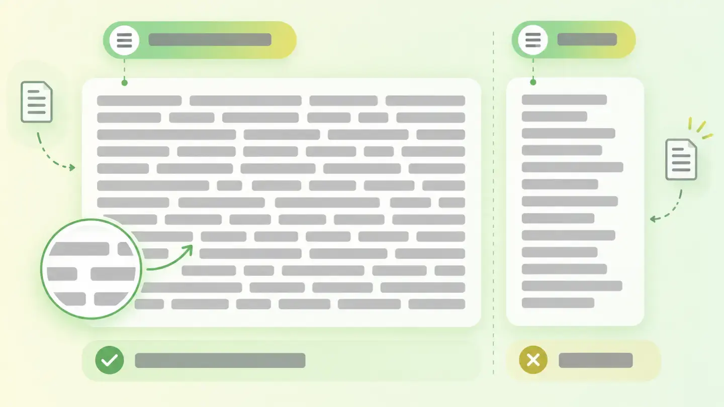
What it is and what this finding checks
Visual readability is the part of reading that depends on design and not content. Clear, well-written text can be exhausting if it’s poorly presented, and readers rarely know what to blame it on: they just give up sooner.
This finding looks at two specific aspects of that presentation. The first is line length: how many characters fit on a line before the eye has to jump to the next. The second is justified text, meaning text aligned to both the left and right margins by stretching the spaces between words.
Both come from the same place: WCAG success criterion 1.4.8, level AAA, which lists five requirements for blocks of text. Two of them are exactly these: that the width not exceed 80 characters —40 for Chinese, Japanese or Korean script— and that the text not be justified to both margins.
How it’s measured
Wakaris analyzes the URL you give it and returns both results: whether there are text blocks whose lines run too long and whether there are justified blocks. It’s the direct way to find out without installing anything or creating an account.
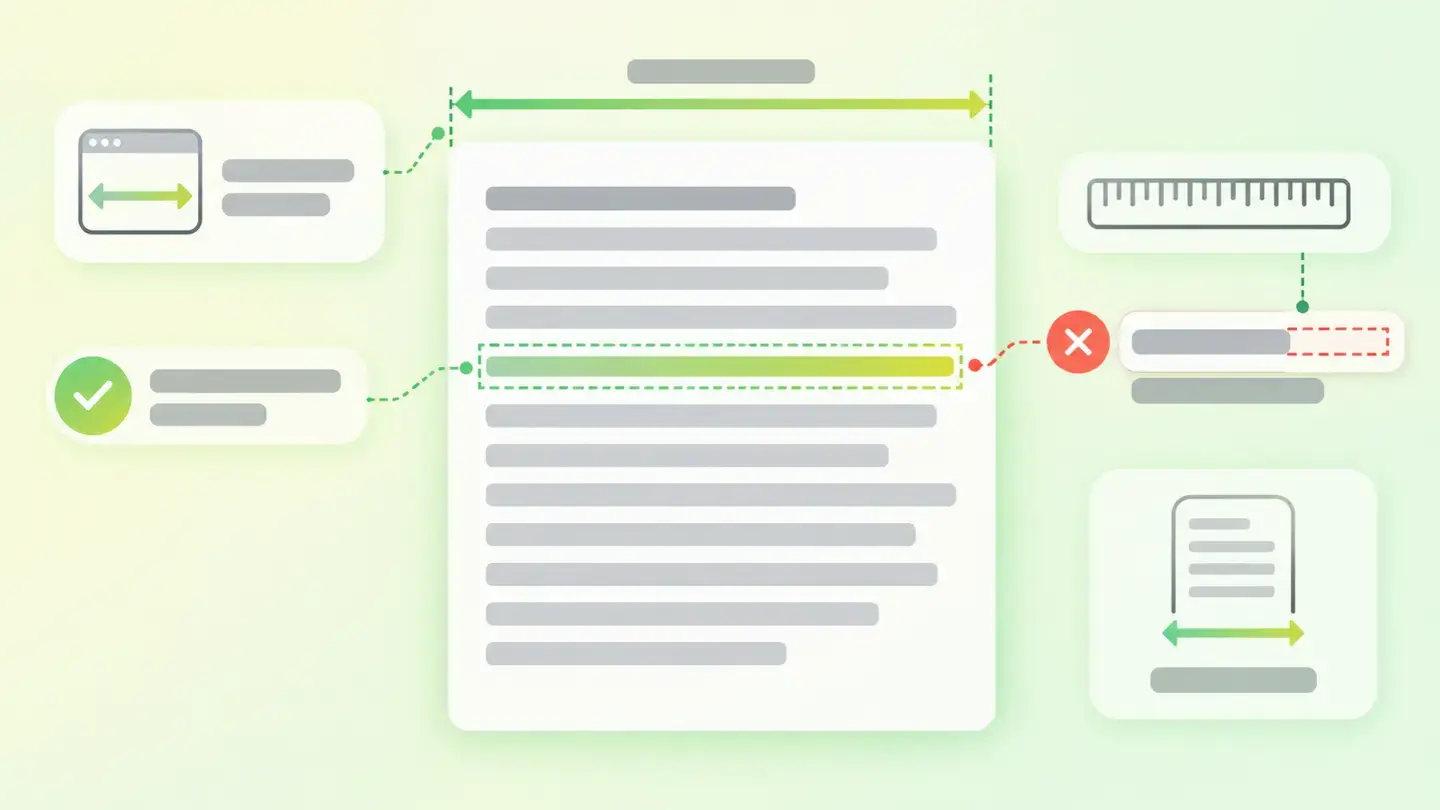
There’s one detail of the method worth knowing, because it changes how you read the result. Line length isn’t a fixed property of the text: it depends on the width at which the page is drawn. The same paragraph fits sixty characters per line in a narrow window and a hundred and twenty on a wide monitor. That’s why this finding is mainly a large-screen problem, and doesn’t show up on mobile, where the width already limits the line on its own.
Justified text, on the other hand, is a declared property: it’s written in the page’s styles and doesn’t depend on the window size. What does change with width is how much it bothers, because the uneven gaps between words get bigger when there are few words per line.
Why it matters
The W3C documentation is specific about both effects, and neither is cosmetic.
About long lines, it says that for people with some reading or vision disabilities they become a significant barrier: they have trouble keeping their place and following the flow of the text. Moving to the next line is the tricky moment, and the longer the journey the easier it is to land back on a line already read.
About justified text, the W3C describes a documented failure: the uneven spacing between words creates “rivers of white” running down the page that make reading difficult and in some cases impossible, and it notes that many people with cognitive disabilities have serious problems with it. MDN’s documentation adds the same warning, explicitly mentioning dyslexia.
It’s worth stressing that neither one breaks anything: the page works, the text is all there and nobody will report an error. The cost is paid in silent abandonment, which is the hardest to detect without measuring it.
Common causes
The two causes are different and have very different origins too.
Long lines almost always come from an omission: the text container takes up all the available width because nobody set a limit. On a thirteen-inch screen you don’t notice; on a wide monitor, the paragraph stretches from side to side and the line becomes endless. It’s a failure the team rarely sees, because they usually review the design on their own screen and not on the biggest one.
Justified text is usually an aesthetic choice inherited from print, where it works because type is set with hyphenation and fine adjustments that the browser doesn’t do by default. It arrives in three ways: the template’s styles, a content editor with a justify button used by hand, or a document laid out in a word processor and pasted as is.
How to fix it
Both fixes are CSS and neither touches the content. Wakaris tells you which of the two results came up, and that already tells you where to look.
For long lines, the fix is to set a maximum width on the text block instead of letting it grow. It’s best expressed in a unit relative to the font size rather than fixed pixels, so the limit still holds when someone enlarges the text. The reference is the standard’s 80 characters, and in practice reading columns usually stay well below that.
For justified text, the solution the W3C recommends is direct: don’t set text justified to both margins. Align it left and the right margin will be ragged, which is exactly the point, because that uneven edge helps the eye tell one line from another. Check the two places where this is decided: the stylesheet and what the editor lets writers do.
Diagram of a text block with a marked maximum width and a ruler showing the eighty-characters-per-line limit
Brief to generate the image
Editorial illustration for a Wakaris technical guide.
Topic: Diagram of a text block with a marked maximum width and a ruler showing the eighty-characters-per-line limit.
Style: white background with a soft lime→pale green wash (#F8F7D6 → #E2F2DC), green→lime gradient accent (#8ED390 → #DCD86F), near-black ink (#12150B), pill shapes and rounded corners, soft shadows, clean schematic look, no photography.
Format: 16:9, 1440 pixels wide.
No legible text: any label, code or figure is shown as grey filler bars. The caption carries the meaning, not the image.
No real logos or third-party brands. No recognizable people.
Tags: readability, visual, diagram, block, text, width, maximum, marked
Ask your AI
If you want to dig into your specific case, copy one of these two prompts and paste it into the AI you use. Pick the one that fits your situation.
I already have the finding measured with Wakaris and want to fix it
Act as a professional, careful technical web consultant. Your goal is to help me understand a specific finding about my website and decide what to do about it, without making anything up.

Context: I got this finding from Wakaris, a tool that analyzes a website across 9 areas (performance, SEO, security, social, market, AI, user experience, accessibility and legal) and explains each problem so every role on a team can understand it. The finding is: Visual readability. It means my page has lines of text that are too long, or blocks of text justified to both margins, or both. Reference: WCAG 2.2 success criterion 1.4.8, level AAA, requires no more than 80 characters per line and text that isn’t justified.

Paste the Wakaris result here: which of the two cases came up and on which page. If you don’t have it, tell me and I’ll explain how to get it before we continue.

Rules you must follow at all times:

1. Don’t assume anything about my website. Every piece of data you use must come from what I confirm or from what Wakaris measured. If you don’t know something, ask me before stating it.
2. Before giving me any conclusions, ALWAYS ask me these questions, all together and in plain language, to find out whether this finding really affects me and where:
   a) What platform is your website on? (WordPress, Shopify, custom build, other)
   b) Which of the two came up: long lines, justified text, or both?
   c) Where is the affected text: article bodies, product pages, service pages, the footer?
   d) Does someone write the text in a visual editor, or is it laid out in the template?
   e) If it’s justified text, does it come from the template or does the writer justify it?
   f) On what screen do you usually review the website: laptop, wide monitor, phone?
   g) If the stylesheet needs changing, would you do it, an in-house technician or an agency?
3. Every statement or recommendation must be argued with respect to MY context, not in general. If you recommend something, explain why it applies to my case.
4. Always flag your level of certainty. If something is a hypothesis because you can’t check it, say so: you can’t see my website, you’re reasoning from what I tell you.
5. Don’t suggest irreversible or risky technical changes (editing the stylesheet directly in production) without first warning me about the risk and that a backup or a test environment is advisable.
6. Keep in mind that line length depends on screen width: if you suggest a fix, tell me how it behaves on a wide monitor, a laptop and a phone, and don’t make me change the mobile design to fix a desktop problem.
7. If you need data that can only be obtained by analyzing the website (confirming which blocks it’s in or whether the fix worked), tell me and recommend I run the page through Wakaris again: that gets checked, not guessed.
8. The final decision is mine, not yours. Your role is to help me understand and prepare the action, not to decide for me.
9. If the fix is beyond what I can do myself, or a team will carry it out, help me get the problem ready to hand over: what it is, where it is, why it matters and what should be done, in a format that person can act on.

Source of this finding: https://www.wakaris.com/en/guides/user-experience/visual-readability
To check it or check it again: https://www.wakaris.com/

Start by briefly introducing yourself in your role and asking me the first block of questions.
I haven’t measured it yet and want to check whether my website has this problem
Act as a professional, careful technical web consultant. I’m looking into whether my website has a specific problem and I want you to help me find out honestly, without taking it for granted.

Context: I came to this through Wakaris, a tool that analyzes a website across 9 areas (performance, SEO, security, social, market, AI, user experience, accessibility and legal) and explains each problem so every role on a team can understand it. The problem I want to look into is: Visual readability. It means having lines of text that are too long or blocks of text justified to both margins. Reference: WCAG 2.2 success criterion 1.4.8 requires no more than 80 characters per line and unjustified text. I do NOT know yet whether my website has it: I want to find out.

Rules you must follow at all times:

1. First and most important: this is checked on the real page and depends on the width at which it’s drawn, and you can’t analyze my website from this conversation. Make it clear from the start that you won’t be able to give me a definitive "yes, you have it" or "no, you don’t", only a hypothesis based on what I tell you.
2. Don’t assume anything. Before giving me any assessment, ALWAYS ask me these questions, all together and in plain language, to estimate whether I’m likely to have the problem:
   a) When you open a page with long text on a wide monitor, does the paragraph span the full width of the screen or stay in a centered column?
   b) Do the paragraphs have a straight right margin, like in a book, or a ragged one?
   c) Does someone write the text in a visual editor with alignment buttons?
   d) Do you paste content from a word processor?
   e) What platform is it on and with which template? (WordPress, Shopify, custom build, other; or I don’t know)
   f) On what screen do you usually review the website?
3. Based on my answers, give me a clear estimate of whether it’s LIKELY or UNLIKELY that I have it and which of the two cases would be the suspect, argued from what I’ve told you and explicitly marked as a hypothesis, not a diagnosis.
4. Tell me directly that the only way to really know is to check, and that I can do it for free and without creating an account by running my website through Wakaris, which will tell me whether there are lines that are too long, whether there are justified blocks and, along the way, the state of the other areas.
5. If I ask you how to check it by hand, don’t hide it from me, but remind me that Wakaris does it faster, on the real page and with extra information I can’t get by hand.
6. If checking shows I do have it, tell me the next step is to understand how it affects me and how to fix it in my specific case.
7. The conclusion and the decision are mine, not yours. You help me find my bearings.

Source of this finding: https://www.wakaris.com/en/guides/user-experience/visual-readability
To check it: https://www.wakaris.com/

Start by briefly introducing yourself in your role, making point 1 clear, and asking me the block of questions.
Frequently asked questions
How many characters should a line of text have? +
WCAG success criterion 1.4.8 sets the limit at 80 characters per line, and 40 for Chinese, Japanese or Korean script. It’s a ceiling, not a target: comfortable reading columns usually stay well below that figure.
Is justified text a mistake? +
The W3C documents it as an accessibility failure, not a matter of taste. The reason is the uneven spacing between words, which forms “rivers of white” running down the page and makes it hard to follow the line, especially for people with cognitive disabilities.
Why doesn’t the problem show up on mobile? +
Because the screen width limits the line on its own: a phone can hardly fit 80 characters per line. This finding is mainly a wide-monitor problem, which is exactly where teams tend not to review their own website.
Does this affect my rankings? +
There’s no stated link to rankings. Its effect is on reading: people who can’t follow the text comfortably leave before finishing it. Treat it as a user experience and accessibility improvement, not a search lever.
Sources cited
- w3.orgUnderstanding Success Criterion 1.4.8: Visual Presentation, W3C: the criterion’s five requirements, including the 80-characters-per-line limit (40 for CJK script) and unjustified text, and the explanation of why long lines make readers lose their place.
- w3.orgF88: Failure of Success Criterion 1.4.8 due to using text that is justified, W3C: the “rivers of white” produced by uneven spacing, who they affect and the recommendation not to justify.
- developer.mozilla.orgtext-align, MDN: what justification does exactly in the browser and its accessibility warning about uneven spacing and dyslexia.

Updated: September 8, 2026.
This article is part of Wakaris, which analyzes your website across 9 areas and explains each finding so every role on your team can understand it.