In short
What it checks
the viewport tag and the page’s actual behavior at 375 px (mobile) and 768 px (tablet).
Expected result
content fits the available width with no horizontal scrolling and without the browser having to shrink it.
Why it matters
Google indexes and ranks the mobile version of your website, crawled with its smartphone agent.
Severity in Wakaris
Critical. Fails on 23% of the pages analyzed.
What this finding is and what it checks
This finding shows up when your page doesn’t adapt to the width of the screen it’s shown on. Wakaris detects it with three pieces of evidence: whether the viewport tag is set up, and whether the page behaves well when loaded at 375 pixels wide, the size of a typical phone, and at 768 pixels, the size of a tablet in portrait mode.
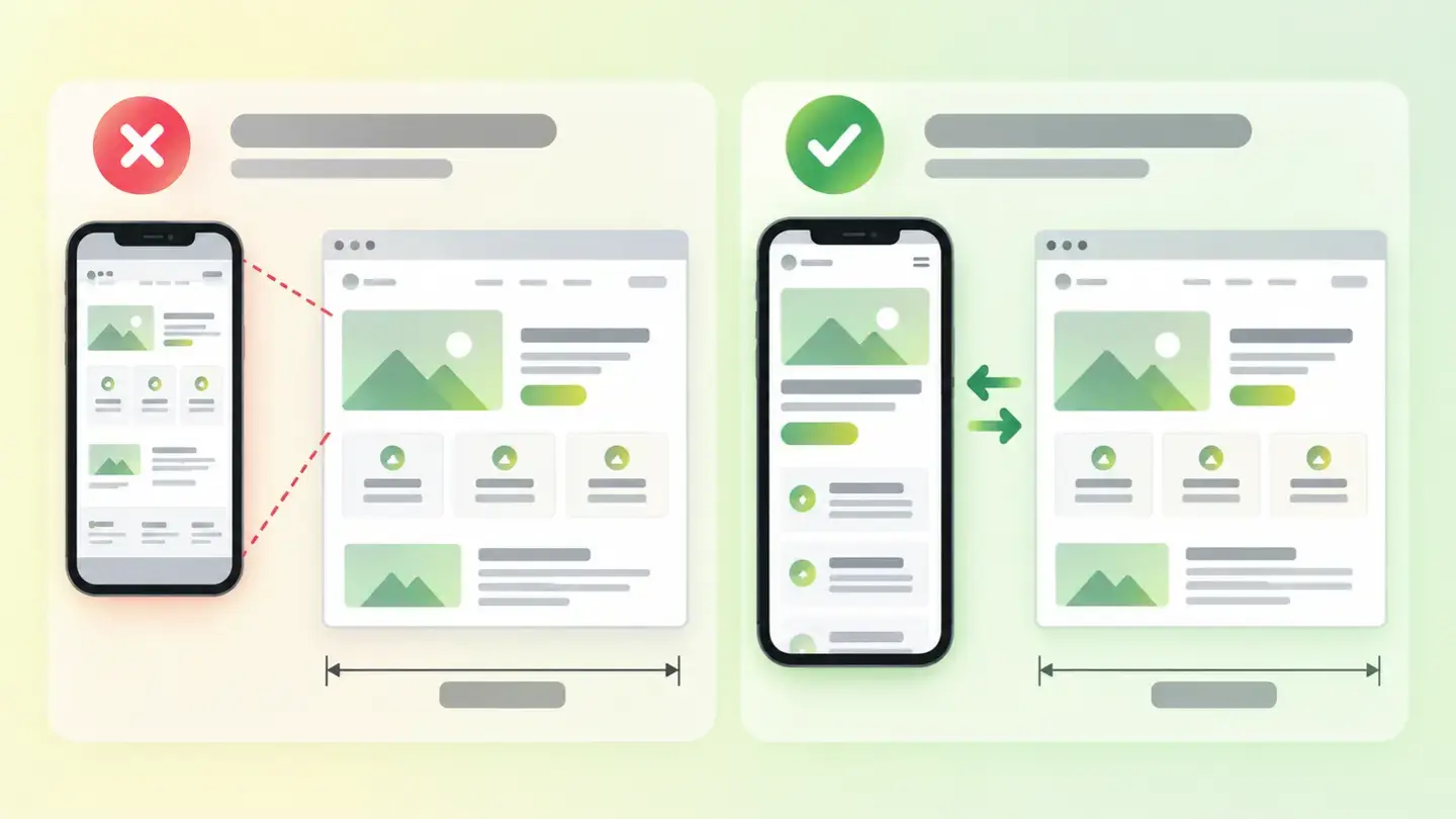
The viewport tag is a line in the HTML head that tells the mobile browser how to size the viewing window. According to MDN, without it some devices draw the page in a virtual window wider than the screen and then shrink it to fit: on a 640-pixel phone it may be drawn at 980 and then scaled down.
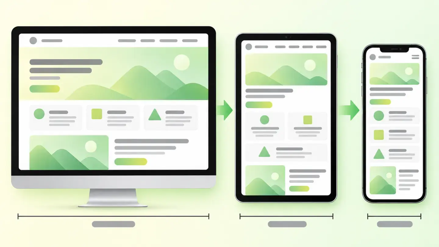
Being responsive is the opposite of that shrinking: the layout rearranges itself to the available space, columns stack, images resize and text keeps a readable size.
How it’s checked
Wakaris loads the URL you give it at two different widths, 375 and 768 pixels, and watches what happens to the content at each. If elements spill beyond the available width and cause horizontal scrolling, or if the page doesn’t rearrange and appears shrunk, the corresponding evidence fails. Separately, it reads the HTML head and checks whether the viewport tag exists and is set to use the device width. The report tells you which of the three pieces of evidence failed and on which page, with nothing to install.
The setting recommended by both MDN and Google documentation is width=device-width, initial-scale=1. The first part tells the browser to use the device’s real width; the second sets a 1:1 ratio between CSS pixels and device pixels, whatever the orientation.
It’s a binary finding: the page either adapts or it doesn’t. The report doesn’t give a number but the result of each check.
Why it matters
It matters for two reasons, and the second carries more weight than it seems.
The first is whoever visits your website on a phone. If the page appears shrunk, the text is unreadable and the buttons are too small for a finger. If content spills off the right edge, you have to scroll sideways to read every line. web.dev sums it up: nobody should be forced to scroll horizontally or zoom out to see the whole page.
The second is search ranking. Google documents that it uses the mobile version of the content, crawled with its smartphone agent, for indexing and ranking: mobile-first indexing. What your website shows on mobile is what Google evaluates. It adds that being mobile-friendly isn’t required to appear in results, but it strongly recommends it, and that responsive design is the pattern it advises.
There’s also an accessibility side: WCAG 2.2 success criterion 1.4.10, level AA, requires content without two-dimensional scrolling at a width equivalent to 320 CSS pixels.
Common causes
The causes fall into three groups; it’s worth identifying yours before you touch anything.
The first is a missing or misconfigured viewport tag. It’s the most common in older or hand-built websites: without it, the mobile browser shrinks the whole page. It also fails when the tag sets a width in pixels instead of the device width.
The second is content with fixed widths. A 1,200-pixel image with no size limit, a table with fixed-width columns, an embedded video with absolute dimensions or a container with a width in pixels will spill beyond the available space and cause horizontal scrolling, even if the viewport tag is fine.
The third is missing breakpoints, that is, CSS rules that change the layout depending on the width. A three-column layout that doesn’t stack on mobile forces each column into 125 pixels, and the result is unreadable text or overflowing columns. It usually comes from old templates or sections added without checking them on mobile.
How to fix it
The first thing is to know which of the three pieces of evidence failed, because the fix is different. Wakaris tells you in the report; from there, from least to most effort.
If the viewport tag is missing, add it to the HTML head with width=device-width, initial-scale=1. It usually fixes the shrinking in one go. Don’t add user-scalable=no: MDN warns that blocking zoom shuts out people with low vision.
If the problem is overflowing content, replace fixed widths with relative ones. web.dev recommends giving images a max-width of 100%, which shrinks them to fit without stretching them. For videos, tables and iframes, a container with its own scrolling stops them from dragging the whole page along.
If the layout doesn’t rearrange, you need media queries that stack the columns below a certain width. web.dev advises against setting breakpoints by device or brand; let the content show you where it stops reading well.
Comparison of a page without a viewport tag, shrunk to a virtual width of 980 pixels, next to the same page with the tag and readable text
Brief for generating the image
Editorial illustration for a Wakaris technical guide.
Topic: Comparison of a page without a viewport tag, shrunk to a virtual width of 980 pixels, next to the same page with the tag and readable text.
Style: white background with a soft lime→pale green wash (#F8F7D6 → #E2F2DC), green→lime gradient accent (#8ED390 → #DCD86F), near-black ink (#12150B), pill shapes and rounded corners, soft shadows, clean schematic look, no photography.
Format: 16:9, 1440 pixels wide.
No legible text: any label, code or figure is shown as gray placeholder bars. The caption carries the meaning, not the image.
No real logos or third-party brands. No recognizable people.
Tags: responsive, comparison, page, tag, viewport, shrunk, width
Ask your AI
If you want to dig deeper into your specific case, copy one of these two prompts and paste it into the AI you use. Pick the one that fits your situation.
I already have the finding measured with Wakaris and want to fix it
Act as a professional, careful technical web reviewer. Your goal is to help me understand a specific finding about my website and decide what to do about it, without making anything up.

Context: I got this finding from Wakaris, a tool that analyzes a website across 9 areas (performance, SEO, security, social, market, AI, user experience, accessibility and legal) and explains each problem so that every profile on a team can understand it. The finding is: Responsive design. It checks whether my page adapts to the screen width: whether the viewport tag is set up and whether the content fits without horizontal scrolling when loaded at 375 pixels (mobile) and 768 pixels (tablet). Benchmark: the viewport tag should use the device width and the page should not overflow or look shrunk at either width.

Paste the Wakaris result here: which evidence failed (viewport, 375 px or 768 px), on which page and, if it says, which element overflows. If you don’t have it, tell me and I’ll tell you how to get it before we continue.

Rules you must follow at all times:

1. Don’t assume anything about my website. Every piece of data you use must come from what I confirm to you or from what Wakaris has measured. If you don’t know something, ask me before stating it.
2. Before giving me any conclusions, ALWAYS ask me these questions, all together and in plain language, to find out whether this finding really affects me and where:
   a) What platform is your website built on? (WordPress, Shopify, custom-built, other)
   b) Of the three checks, which one failed: the viewport tag, the 375-pixel view, the 768-pixel one, or several?
   c) When you open the page on a phone, does everything look very small, or is it a good size but you have to scroll sideways?
   d) Does the page have tables, embedded videos, maps or very wide images?
   e) Is the template or theme recent, or hasn’t it been updated in years?
   f) Can you edit the website’s HTML and CSS, or do you depend on a visual editor?
   g) If a technical fix is needed, would you do it yourself, or would an in-house technician or an agency do it?
3. Every statement or recommendation must be justified in terms of MY context, not in general. If you recommend something, explain why it applies to my case.
4. Always state your level of certainty. If something is a hypothesis because you can’t measure it, say so: you can’t see my website, you’re reasoning from what I tell you.
5. Don’t suggest irreversible or risky technical changes (server configuration, deleting resources, direct changes in production) without first warning me about the risk and that a backup or a test environment is advisable.
6. If you need data that can only be obtained by checking the website (confirming the actual result, the exact page, or whether the fix worked), tell me and recommend that I run the page through Wakaris again: that gets checked, not guessed.
7. The final decision is mine, not yours. Your role is to help me understand and prepare the action, not to decide for me.
8. If the fix goes beyond what I can do myself, or a team will carry it out, help me get the problem ready to hand over: what it is, where it is, why it matters and what should be done, in a format that person can act on.

Source of this finding: https://www.wakaris.com/en/guides/user-experience/responsive-design
To check it or check it again: https://www.wakaris.com/

Start by briefly introducing yourself in your role and asking me the first set of questions.
I haven’t measured it yet and want to check whether my website has this problem
Act as a professional, careful technical web reviewer. I’m looking into whether my website has a specific problem, and I want you to help me find out honestly, without taking it for granted.

Context: I came to this through Wakaris, a tool that analyzes a website across 9 areas (performance, SEO, security, social, market, AI, user experience, accessibility and legal) and explains each problem so that every profile on a team can understand it. The problem I want to look into is: Responsive design. A responsive website adapts to the screen width: you don’t have to zoom or scroll sideways to read it. It’s checked by loading the page at 375 pixels (mobile) and 768 (tablet) and reviewing the viewport tag in the head. I DON’T know yet whether my website has it: I want to find out.

Rules you must follow at all times:

1. First and most important: this is CHECKED on the real page, and you can’t check my website from this conversation. Make it clear from the start that you won’t be able to give me a definitive "yes, you have it" or "no, you don’t", only a hypothesis based on what I tell you.
2. Don’t assume anything. Before giving me any assessment, ALWAYS ask me these questions, all together and in plain language, to estimate whether I’m likely to have the problem:
   a) When you open your website on a phone, is the text a readable size, or is everything very small so you have to zoom in?
   b) Do you have to scroll sideways to read any part of the page?
   c) Does the website have several columns on desktop? Do they stack one below the other on mobile, or do they stay side by side?
   d) Does it have tables, embedded videos, maps or large images?
   e) Roughly what year is the design or template from?
   f) What platform is it built on? (WordPress, Shopify, custom-built, other; or I don’t know)
3. Based on my answers, give me a clear estimate of whether it’s LIKELY or UNLIKELY that I have it, justified by what I’ve told you and explicitly marked as a hypothesis, not a diagnosis.
4. Tell me directly that the only way to really know is to check it, and that I can do it for free and without creating an account by running my website through Wakaris, which will give me the actual result, which check fails and on which page and, along the way, the status of the other areas.
5. If I ask you how to check it by hand, don’t hide it from me, but remind me that Wakaris does it faster, on the real page and with extra information I don’t get by hand.
6. If, once checked, it turns out I do have it, tell me the next step is to understand how it affects me and how to fix it in my specific case.
7. The conclusion and the decision are mine, not yours. You help me find my way.

Source of this finding: https://www.wakaris.com/en/guides/user-experience/responsive-design
To check it: https://www.wakaris.com/

Start by briefly introducing yourself in your role, making point 1 clear, and asking me the set of questions.
Frequently asked questions
What is the viewport tag and what value should it have? +
It’s a line in the HTML head that tells the mobile browser how to size the viewing window. The value recommended by MDN and Google is width=device-width, initial-scale=1: it uses the device’s real width and sets an initial one-to-one scale between CSS pixels and screen pixels.
Why does Wakaris check at 375 and 768 pixels? +
Because they’re two representative widths: 375 pixels is a typical phone in portrait mode and 768 is a tablet in portrait mode. If the page adapts well at both, it very likely does at the sizes in between. Checking two widths lets you tell a mobile-only failure apart from a layout that doesn’t adapt at all.
Can a website that isn’t responsive appear on Google? +
Yes. Google documents that being mobile-friendly isn’t required to appear in results, although it strongly recommends it. What is a fact is that it indexes and ranks using the mobile version of your content, so whatever looks wrong or is missing on mobile is what Google evaluates.
Is adding the viewport tag enough to fix it? +
It fixes the overall shrinking of the page, which is the most visible symptom, but it doesn’t fix content with fixed widths or a layout that doesn’t rearrange its columns. If those two pieces of evidence also fail, the tag alone can even make the overflow more obvious. It’s worth running the page through Wakaris again after each change.
Sources cited
- developer.mozilla.org<meta name="viewport">, MDN Web Docs: what the viewport tag does, the recommended value, the 980-pixel virtual window and the warning about disabling zoom.
- web.devResponsive web design basics, web.dev: how the mobile browser behaves without the tag,
width=device-width, initial-scale=1, images with amax-widthof 100% and choosing breakpoints based on content. - developers.google.comMobile-first indexing best practices, Google Search Central: indexing and ranking with the mobile version crawled by the smartphone agent, and the recommendation of responsive design.
- w3.orgUnderstanding Success Criterion 1.4.10: Reflow, W3C WAI: content without two-dimensional scrolling at a width equivalent to 320 CSS pixels, level AA.

Updated: September 7, 2026.
This article is part of Wakaris, which analyzes your website across 9 areas and explains each finding so that every profile on your team can understand it.