In short
What’s measured
how many interactive elements on the page are too small or too close to another one.
Standard reference
24 by 24 CSS pixels minimum (WCAG 2.2 level AA) and 44 by 44 as the enhanced target (level AAA).
Why it matters
people with tremors, limited fine motor control or simply large fingers miss the tap and end up activating something they didn’t want.
Severity in Wakaris
Improvement. It appears on 31.2% of pages analyzed by the checker.
What it is and what this finding checks
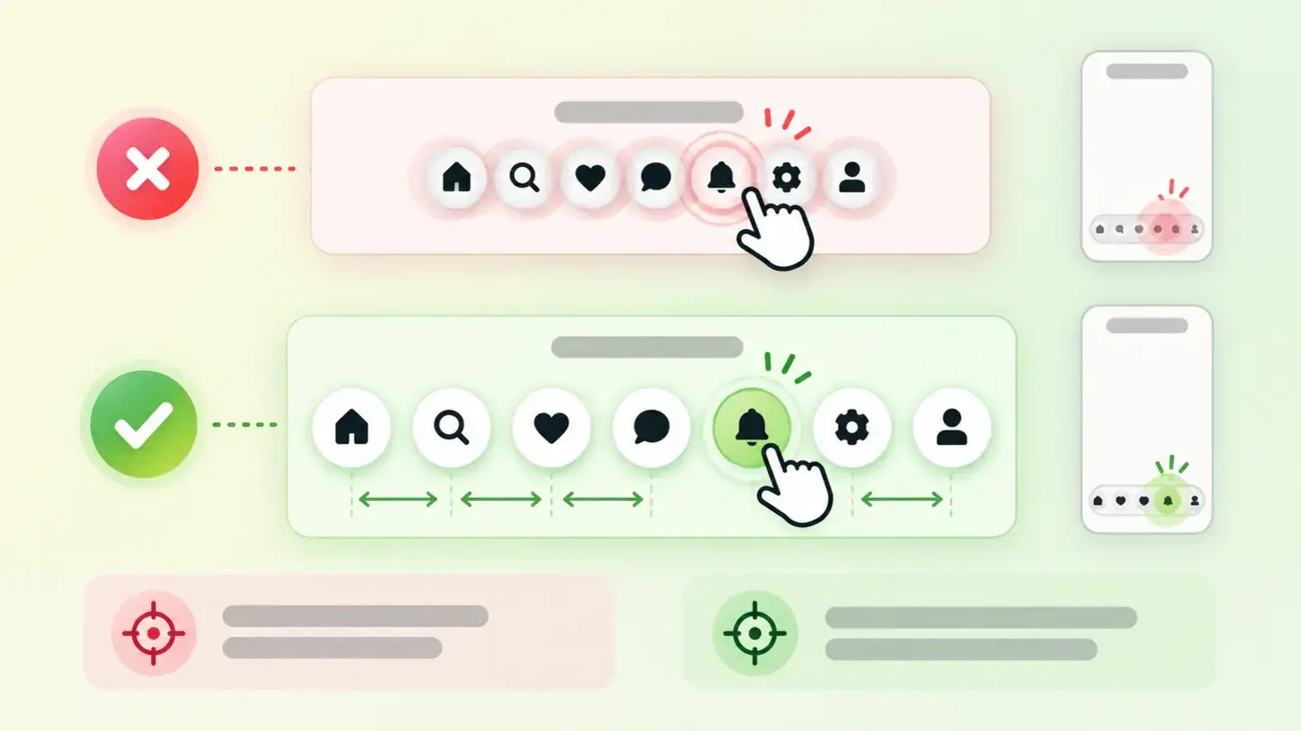
A touch target is any area of the page that responds when you tap or click it: a button, a link, a footer icon, the X that closes a notice, a carousel arrow. The finding fires when any of those targets is so small, or so close to another, that hitting it is no longer trivial.
The reference comes from WCAG 2.2, the W3C’s web accessibility standard. Its success criterion 2.5.8, level AA, requires the target to be at least 24 by 24 CSS pixels. Criterion 2.5.5, stricter and level AAA, raises the recommendation to 44 by 44.
Two nuances are worth keeping in mind from the start. The first is that the standard treats size and spacing as two sides of the same problem: a small element stops failing if it’s isolated enough. The second is that there are built-in exceptions, the most common being links within a sentence.
How it’s measured
Wakaris analyzes the URL you give it, goes through the elements you can interact with and returns how many fall short in size or spacing, along with the finding’s severity. It’s the direct way to get the number without installing anything or creating an account.
The count is read in bands, and that’s the figure that decides how much work you have ahead. A single small element already produces a finding; from ten, and again from thirty, the result escalates. The difference between those bands matters more than it seems: one or two cases are usually a stray icon, while thirty suggest the problem is in the template and repeats on every page of the site.
Two notes on scope. The measurement is done on a specific address, so it describes that page and not the whole site. And size isn’t an absolute value: it depends on the width at which the page is drawn, so the same button can pass on desktop and fall short on mobile.
Why it matters
The underlying reason is explained in the criterion’s own documentation: people with dexterity limitations or difficulty with fine movement can’t accurately activate small targets. The W3C explicitly mentions hand tremors, spasticity and quadriplegia, and adds people with large fingers or who use their phone with a knuckle or part of a finger.
There’s also a physical reason that affects everyone: a finger is bigger than a mouse pointer and covers exactly the spot on the screen being touched. Nobody sees what they’re tapping at the moment they tap it.
The practical cost isn’t only about accessibility. Missing the tap means activating the link next to it, going back and trying again: in a footer with crowded icons it’s annoying, and in a checkout step it’s a direct leak. That’s why you shouldn’t read the Improvement severity as a synonym for irrelevant: the criterion behind it is level AA.
Common causes
It’s almost always the same story: a design made for a mouse that gets carried over to mobile without reviewing the contact areas. These are the most frequent hot spots.
Social media icons in the footer, served at the exact size of the drawing and placed side by side with no margin. Pagination and filters, where the numbers or the X for removing a filter take up as much space as the text and nothing more. Close buttons on cookie notices, pop-ups and promo bars, which are usually the smallest element on the page and the one tapped most.
It’s also common for the tappable area to be smaller than the drawing: an icon that looks big because it has a decorative background, but whose actual link only covers the outline. And dense tables and lists with links on every row, where squeezing lots of information into little height leaves the lines stuck together.
How to fix it
Start with the number Wakaris gives you: with one or two cases you go after specific elements, and with thirty the fix is in the template and it pays to do it once for the whole site.
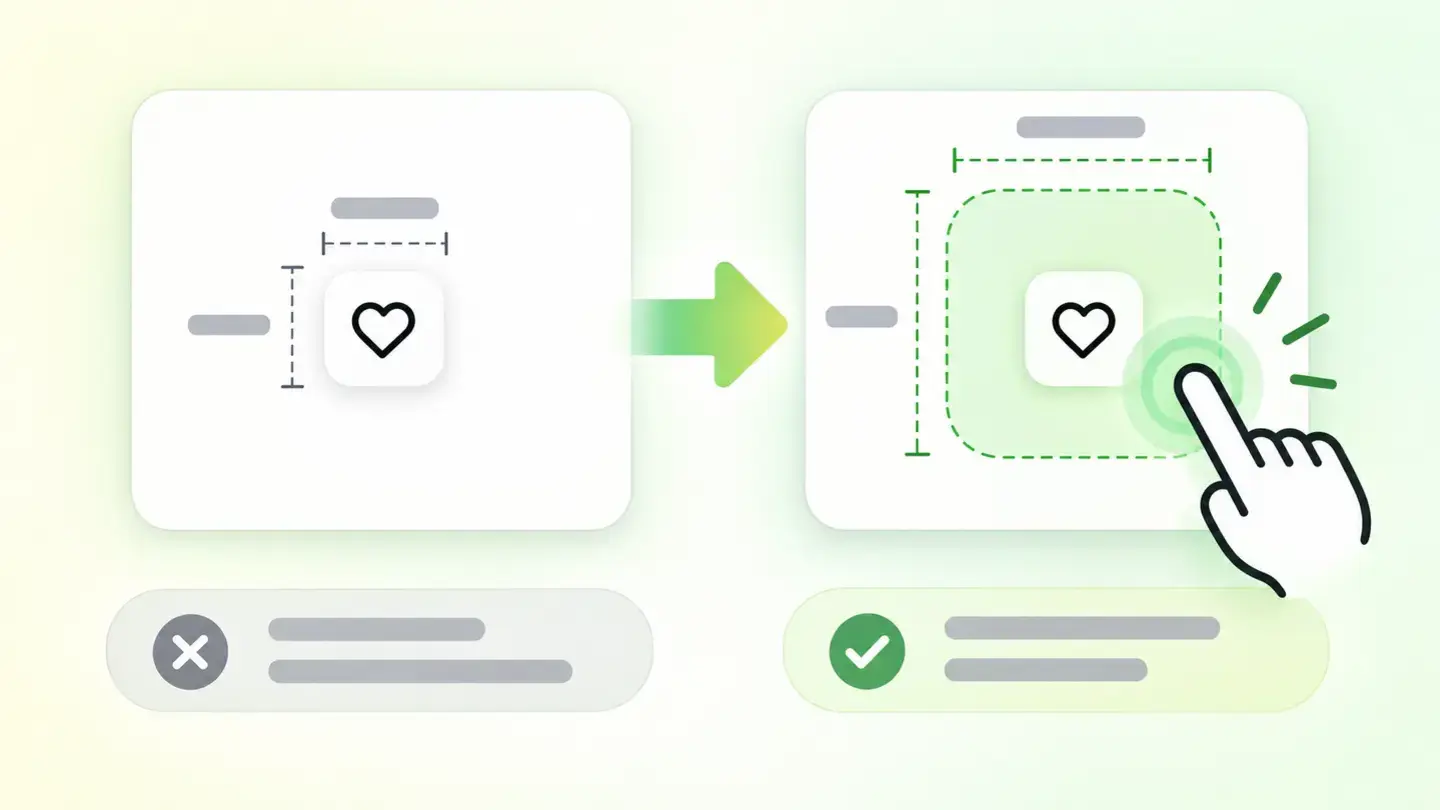
The most cost-effective fix isn’t enlarging the drawing, but the area that responds. You do it by adding padding around the tappable element, so the icon still looks the same and the area that accepts the tap grows underneath. Building on that idea, the W3C documents a direct technique: give the target’s container a minimum height and width of 24 pixels and center the link inside, with a small margin that keeps two neighboring targets from touching.
From there, three checks cover almost everything. Space out anything that’s crowded, because the standard allows small targets if they’re well isolated. Enlarge close buttons, which are the ones missed most. And check the result at a mobile width, not on the desktop where you design it: that’s where the problem shows up.
Diagram of a small icon with a tappable area enlarged by padding around it, without changing the icon’s visible size
Brief to generate the image
Editorial illustration for a Wakaris technical guide.
Topic: Diagram of a small icon with a tappable area enlarged by padding around it, without changing the icon’s visible size.
Style: white background with a soft lime→pale green wash (#F8F7D6 → #E2F2DC), green→lime gradient accent (#8ED390 → #DCD86F), near-black ink (#12150B), pill shapes and rounded corners, soft shadows, clean schematic look, no photography.
Format: 16:9, 1440 pixels wide.
No legible text: any label, code or figure is shown as grey filler bars. The caption carries the meaning, not the image.
No real logos or third-party brands. No recognizable people.
Tags: size, targets, touch, diagram, icon, small, area, tappable
Ask your AI
If you want to dig into your specific case, copy one of these two prompts and paste it into the AI you use. Pick the one that fits your situation.
I already have the finding measured with Wakaris and want to fix it
Act as a professional, careful technical web consultant. Your goal is to help me understand a specific finding about my website and decide what to do about it, without making anything up.

Context: I got this finding from Wakaris, a tool that analyzes a website across 9 areas (performance, SEO, security, social, market, AI, user experience, accessibility and legal) and explains each problem so every role on a team can understand it. The finding is: Touch target size. It means my page has tappable elements (buttons, links, icons) that are too small or too close together to hit with a finger. Reference: WCAG 2.2 requires a minimum of 24 by 24 CSS pixels at level AA, and recommends 44 by 44 at level AAA.

Paste the Wakaris result here: how many elements it counted below the minimum and on which page. If you don’t have it, tell me and I’ll explain how to get it before we continue.

Rules you must follow at all times:

1. Don’t assume anything about my website. Every piece of data you use must come from what I confirm or from what Wakaris measured. If you don’t know something, ask me before stating it.
2. Before giving me any conclusions, ALWAYS ask me these questions, all together and in plain language, to find out whether this finding really affects me and where:
   a) What platform is your website on? (WordPress, Shopify, custom build, other)
   b) How many elements did the analysis count: one or two, around ten, or more than thirty?
   c) Where are most of them: in the footer, in the menu, in pagination or filters, in buttons that close notices, or spread across the content?
   d) Do those elements appear on every page of the site or only on this one?
   e) Are the affected links standalone, or are they links inside a paragraph of text?
   f) If the stylesheet or template needs changing, would you do it, an in-house technician or an agency?
3. Every statement or recommendation must be argued with respect to MY context, not in general. If you recommend something, explain why it applies to my case.
4. Always flag your level of certainty. If something is a hypothesis because you can’t measure it, say so: you can’t see my website, you’re reasoning from what I tell you.
5. Don’t suggest irreversible or risky technical changes (editing the template or stylesheet directly in production) without first warning me about the risk and that a backup or a test environment is advisable.
6. Keep in mind that the standard allows exceptions: a link inside a sentence, or a small target that’s far enough from the others, doesn’t fail. Don’t make me enlarge things that don’t need enlarging.
7. If you need data that can only be obtained by measuring the website (confirming the real count, which area they’re in or whether the fix worked), tell me and recommend I run the page through Wakaris again: that gets measured, not guessed.
8. The final decision is mine, not yours. Your role is to help me understand and prepare the action, not to decide for me.
9. If the fix is beyond what I can do myself, or a team will carry it out, help me get the problem ready to hand over: what it is, where it is, why it matters and what should be done, in a format that person can act on.

Source of this finding: https://www.wakaris.com/en/guides/accessibility/touch-target-size
To measure it or measure it again: https://www.wakaris.com/

Start by briefly introducing yourself in your role and asking me the first block of questions.
I haven’t measured it yet and want to check whether my website has this problem
Act as a professional, careful technical web consultant. I’m looking into whether my website has a specific problem and I want you to help me find out honestly, without taking it for granted.

Context: I came to this through Wakaris, a tool that analyzes a website across 9 areas (performance, SEO, security, social, market, AI, user experience, accessibility and legal) and explains each problem so every role on a team can understand it. The problem I want to look into is: Touch target size. It means having buttons, links or icons that are too small or too close together to tap with a finger. Reference: WCAG 2.2 requires a minimum of 24 by 24 CSS pixels at level AA. I do NOT know yet whether my website has it: I want to find out.

Rules you must follow at all times:

1. First and most important: touch target size is MEASURED on the real page, and you can’t measure my website from this conversation. Make it clear from the start that you won’t be able to give me a definitive "yes, you have it" or "no, you don’t", only a hypothesis based on what I tell you.
2. Don’t assume anything. Before giving me any assessment, ALWAYS ask me these questions, all together and in plain language, to estimate whether I’m likely to have the problem:
   a) When you use your website on a phone, do you ever tap something and the thing next to it gets activated?
   b) Do you have social media, language or share icons lined up and squeezed together?
   c) Are there notices, pop-ups or bars that close with a small X?
   d) Do you have pagination, filters or tables with lots of links in little space?
   e) Was the design made for desktop first and then adapted to mobile, or the other way around?
   f) What platform is it on? (WordPress, Shopify, custom build, other; or I don’t know)
3. Based on my answers, give me a clear estimate of whether it’s LIKELY or UNLIKELY that I have it and in which area it would be, argued from what I’ve told you and explicitly marked as a hypothesis, not a diagnosis.
4. Tell me directly that the only way to really know is to measure it, and that I can do it for free and without creating an account by running my website through Wakaris, which will give me the real count of affected elements and, along the way, the state of the other areas.
5. If I ask you how to check it by hand, don’t hide it from me, but remind me that Wakaris does it faster, on the real page and with extra information I can’t get by hand.
6. If measuring shows I do have it, tell me the next step is to understand how it affects me and how to fix it in my specific case.
7. The conclusion and the decision are mine, not yours. You help me find my bearings.

Source of this finding: https://www.wakaris.com/en/guides/accessibility/touch-target-size
To measure it: https://www.wakaris.com/

Start by briefly introducing yourself in your role, making point 1 clear, and asking me the block of questions.
Frequently asked questions
What’s the minimum size for a button? +
WCAG 2.2 sets 24 by 24 CSS pixels as the minimum in success criterion 2.5.8, which is level AA. Criterion 2.5.5, level AAA, recommends 44 by 44. The W3C itself advises going well beyond the minimum to reduce accidental taps.
Does a link inside a paragraph fail? +
No. The standard includes an explicit exception for targets that sit inside a sentence or whose size depends on the line height of the surrounding text. A link in the middle of a paragraph doesn’t have to be 24 pixels tall to meet the criterion.
What if the element is small but well spaced? +
There’s an exception for that too. The W3C defines it precisely: if a 24-pixel-diameter circle centered on the target doesn’t touch any other target, the smaller size is allowed. That’s why spacing things out is sometimes a better fix than making them bigger.
If the severity is Improvement, can I leave it for last? +
You can rank it behind critical items, but don’t confuse Improvement with optional: the criterion behind it is level AA, the one accessibility tenders usually require. And the fix is cheap, especially if the count points to the template.
Sources cited
- w3.orgUnderstanding Success Criterion 2.5.8: Target Size (Minimum), W3C: the minimum of 24 by 24 CSS pixels, level AA, the exception for inline links, the 24-pixel-diameter circle exception and the dexterity limitations that motivate the criterion.
- w3.orgUnderstanding Success Criterion 2.5.5: Target Size (Enhanced), W3C: the enhanced target of 44 by 44 CSS pixels at level AAA, the recommendation to exceed the minimum and the fact that a finger covers the spot being tapped.
- w3.orgC42: Using min-height and min-width on target container to ensure sufficient target spacing, W3C: the technique of giving the container a minimum height and width of 24 pixels and centering the link inside with a margin.
- developer.mozilla.orgMobile accessibility checklist, MDN: the requirement that touch targets be large enough to interact with.

Updated: September 8, 2026.
This article is part of Wakaris, which analyzes your website across 9 areas and explains each finding so every role on your team can understand it.